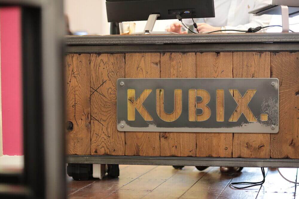
Our CEO Looay Gharib explains how Kubix created such a distinctive brand identity, starting with a name.
Naming your brand is arguably harder than naming a baby. Everything rides upon it. If you’ve ever had to come up with a brand name, you’ll know the power that a name has on clients or customers that use your services. Where would businesses like Apple, Facebook or Google be without their iconic identities? So when I decided to start my own agency, I knew that the brand strategy was the first step on the road to success. I needed a name that was memorable, expandable and could represent different sides of the business. Something that wasn’t cliche and was future-proof. Think it sounds easy? It wasn’t.
In reality, finding the perfect name took a few months. I turned to the suggestions and advice of those I knew who had done it before me, and ended up running through in excess of 100 different ideas. My list became longer, and longer still. It didn’t help that I’d read dozens of online tips that contradicted one other. I read that names that included more ‘unusual’ letters such as Zs, Ks and Xs tended to be more memorable to people. But I also read that people had to be able to spell it easily. It had to sound good over the phone. It couldn’t be anything that would be difficult to market with SEO and social media.
Nevertheless, I took to my research like a duck to water and got stuck in to see what was out there. Many agencies go for an animal with a colour, but they can end up sounding a little random. Purple cat. Blue pelican. Black goat. You name it, it’s probably the name of an agency somewhere in the UK. A whole selection of animals and shades went skipping through my head two by two, like some colourful recreation of Noah’s Ark. I knew that I wanted something significantly different. Something that wasn’t like the others. Animals were out.
I toyed with the idea of Online Ripple for a week or so, until I realised that Ripple rhymed with a word I didn’t think was appropriate for a business. Online Ripple went straight in the bin.
Digi Kiki was next. It had evolved from a random word generator, and I even had the initial logos made up, each one dotted with a bright shade of green. Eventually I didn’t think it sounded serious enough. It sounded like I was launching some virtual tiki bar. Digi Kiki joined Online Ripple in my ever-expanding graveyard of ideas.
Kubix came to me in a quick, unexpected moment. I was sat in my office at home, turning a Rubix Cube over in my hands and looking around my room for inspiration. There was the desk, the chair, a family photo, my jacket abandoned in the corner. I found my eyes resting on the Cube as I twisted it this way and that, any attempts at actually solving it long gone. I liked the word Rubix. I liked what it represented - problem solving, a tricky yet satisfying challenge. A Rubix Cube was colourful, fun, multifaceted.
So what about playing about with the name?
Cubix?
I tried saying it out loud.
“Cubix.”
Cubix had a nice ring to it. I tried writing it onto a piece of paper but something didn’t feel quite right. The ‘C’ felt wrong. Cubix felt like the start of the word ‘cubicle’, and I didn’t exactly want to conjure up images of office workers stuck at their individual desks all day.
Cubix...cubix...but what about Kubix?
Kubix.
And there it was. Like a miniature Eureka moment. Kubix. Just Kubix? Why not Kubix Media? I said it once. I said it again. I wrote it about 20 times. It was abstract, yes, but not too hard for people to spell. It wasn’t an animal, a pun, or a hipster word picked from a dictionary on a whim.
The logo was next. When it came to designing the first version of the logo, I had already found our Lead Designer Elodie. It was she who suggested injecting a pop of colour into the black and white vision I had in my head. She agreed that black and white was classic, but that it felt a little stilted against the other more colourful agencies out there. She suggested a pop of pink.
“Pink?”
“Pink.”
I’d already learnt that when Elodie has a strong design concept in her head, it’s usually best to listen to her. Pink it was. And pink it’s remained.
Since then, we’ve rebranded slightly to Kubix to represent the expanding side of the business as we continue to grow in our various fields. Now we’ve even got a new brand - a Kubix cousin, as it were - on the way. This time the name was far easier to conjure up, and whilst there’ll be no prizes for guessing which letter it starts with, it’s already set to bring a new dimension to the business.
Internally in the office, we still find it hard to resist adding Kubix as a prefix to everything. Kubix Clothing for our team jackets, Kubix Coffee for our Nespresso addictions, Kubix Clients for our amazing customers. As silly as some of these might be, it’s amazing to see how the name can now be used wherever we go. Some names work. Some names die a death. But I’m confident that Kubix is original and timeless enough that it’ll last for many, many years to come.


